Camp Robber Creative
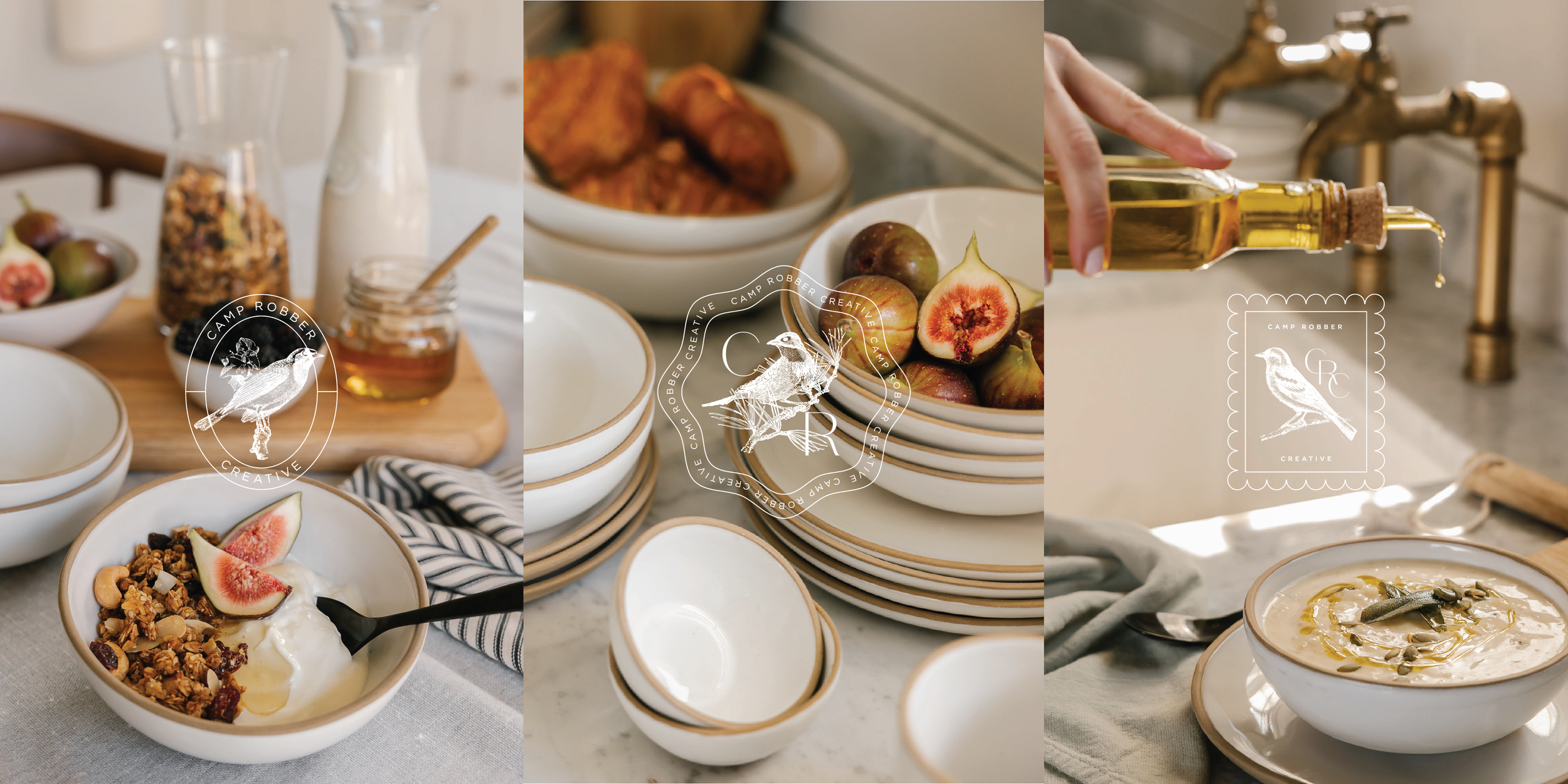
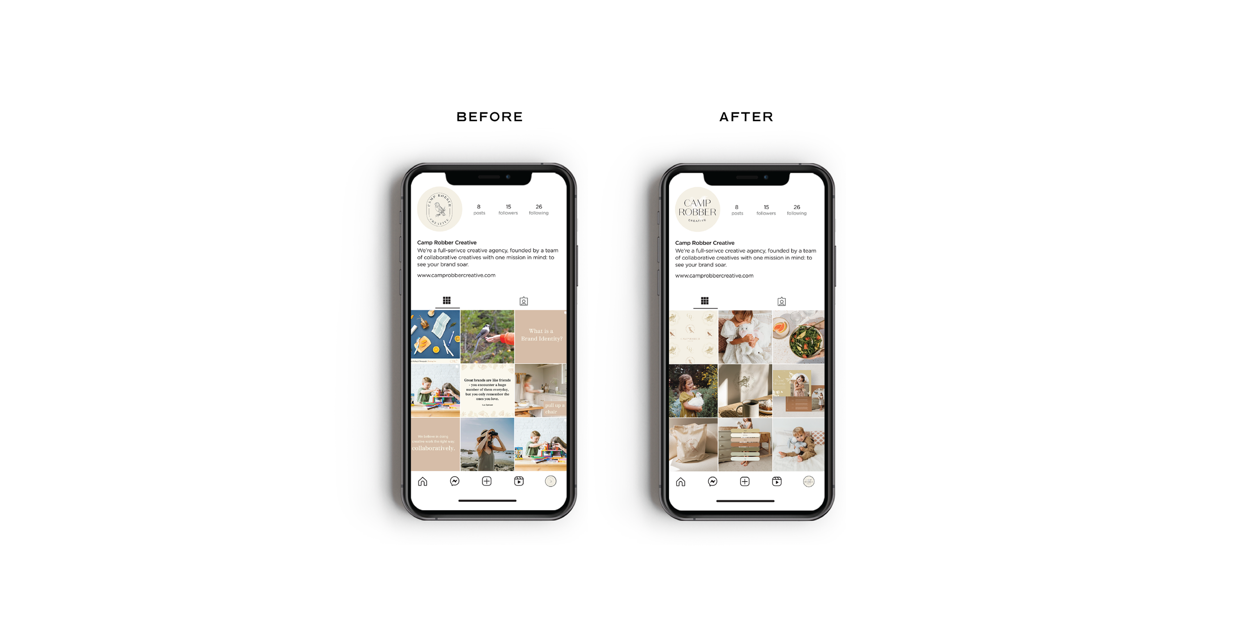
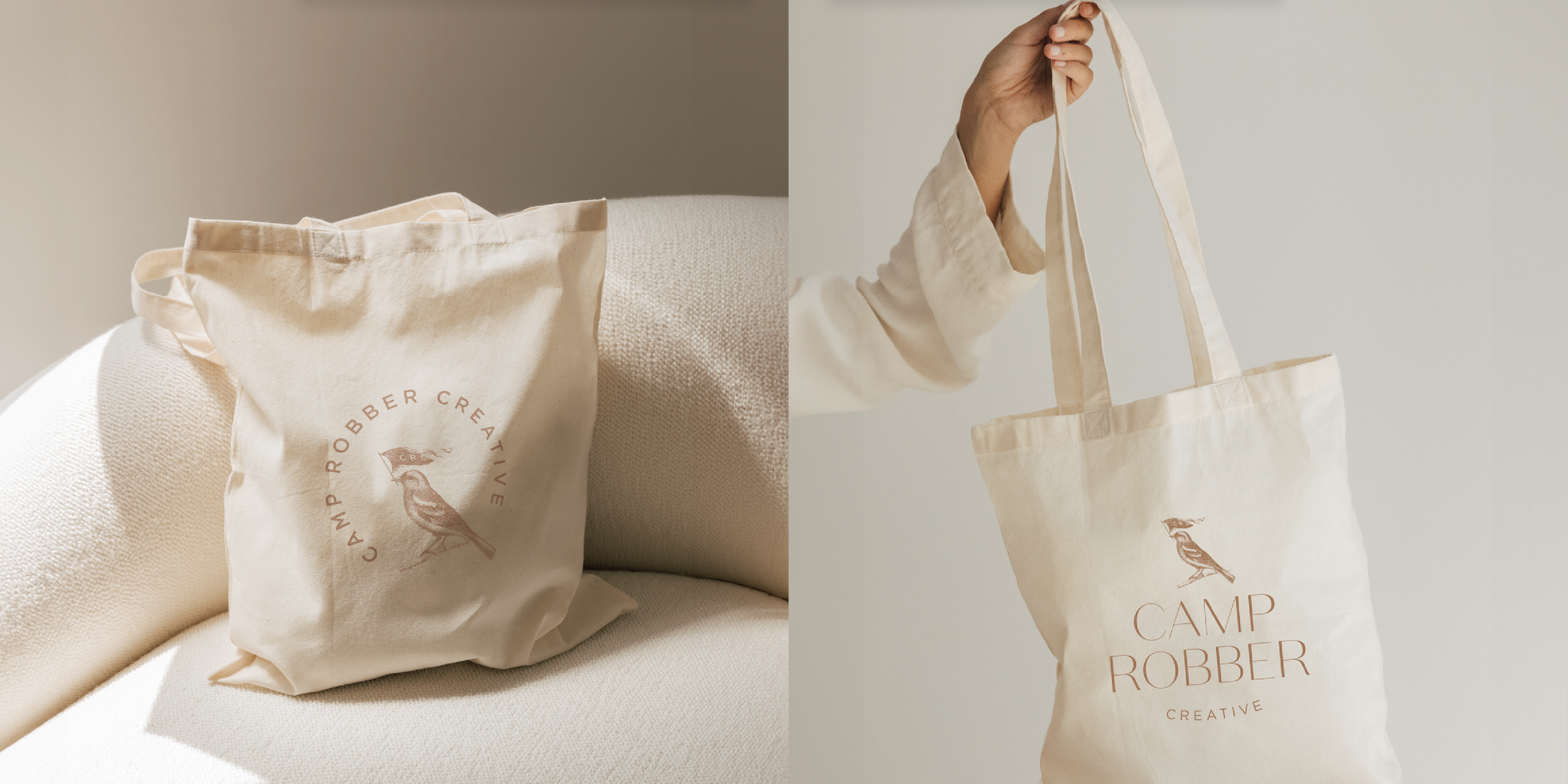
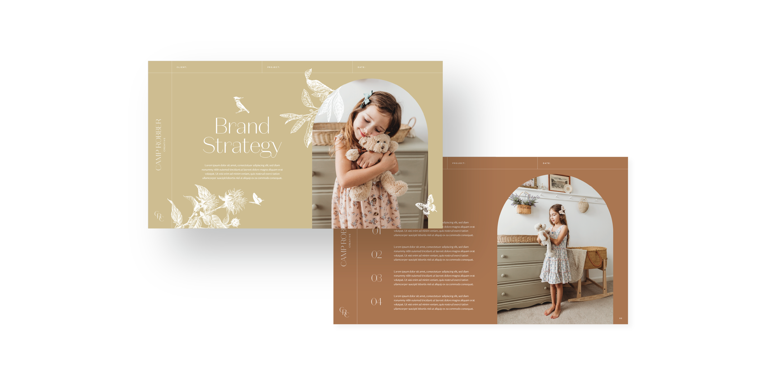
This rebranding project highlights the process of creating a cohesive and sophisticated visual identity. By refining the typeface with curvaceous forms and statuesque headers, I’ve balanced feminine elegance with a grounded, polished aesthetic. The goal was to modernize the monogram, streamline logo variations, and introduce elevated graphic devices while preserving the integrity of the original brand elements like the signature terra cotta palette. Thoughtful attention to detail—such as incorporating engraved-style florals and birds—ensures that every design decision contributes to a consistent, elevated brand experience.


